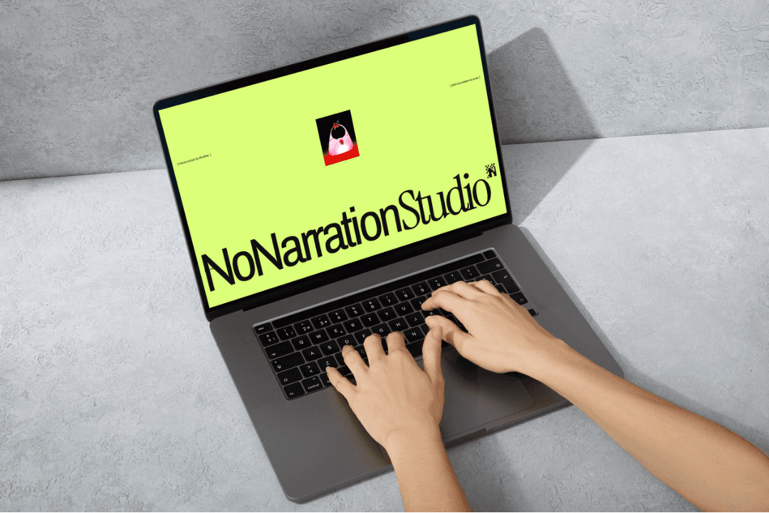
NoNarration Studio
A design studio website template.
Year
2025
Scope
Website
Client
Playful Software
Hatch was changing. When I joined, it was playful-first — fun, alternative, a bit chaotic in the best way, the kind of sites you'd find on hoverstat.es. But the team had made a decision: we were going after a more serious, award-winning audience. The kind of designers and studios who live on Awwwards.
That meant the templates had to change too.
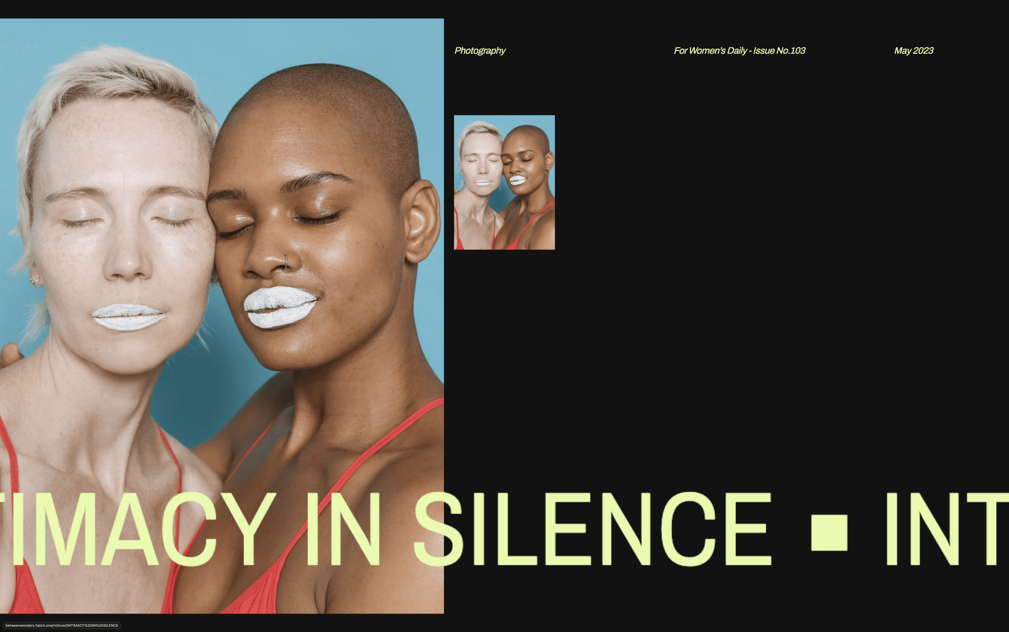
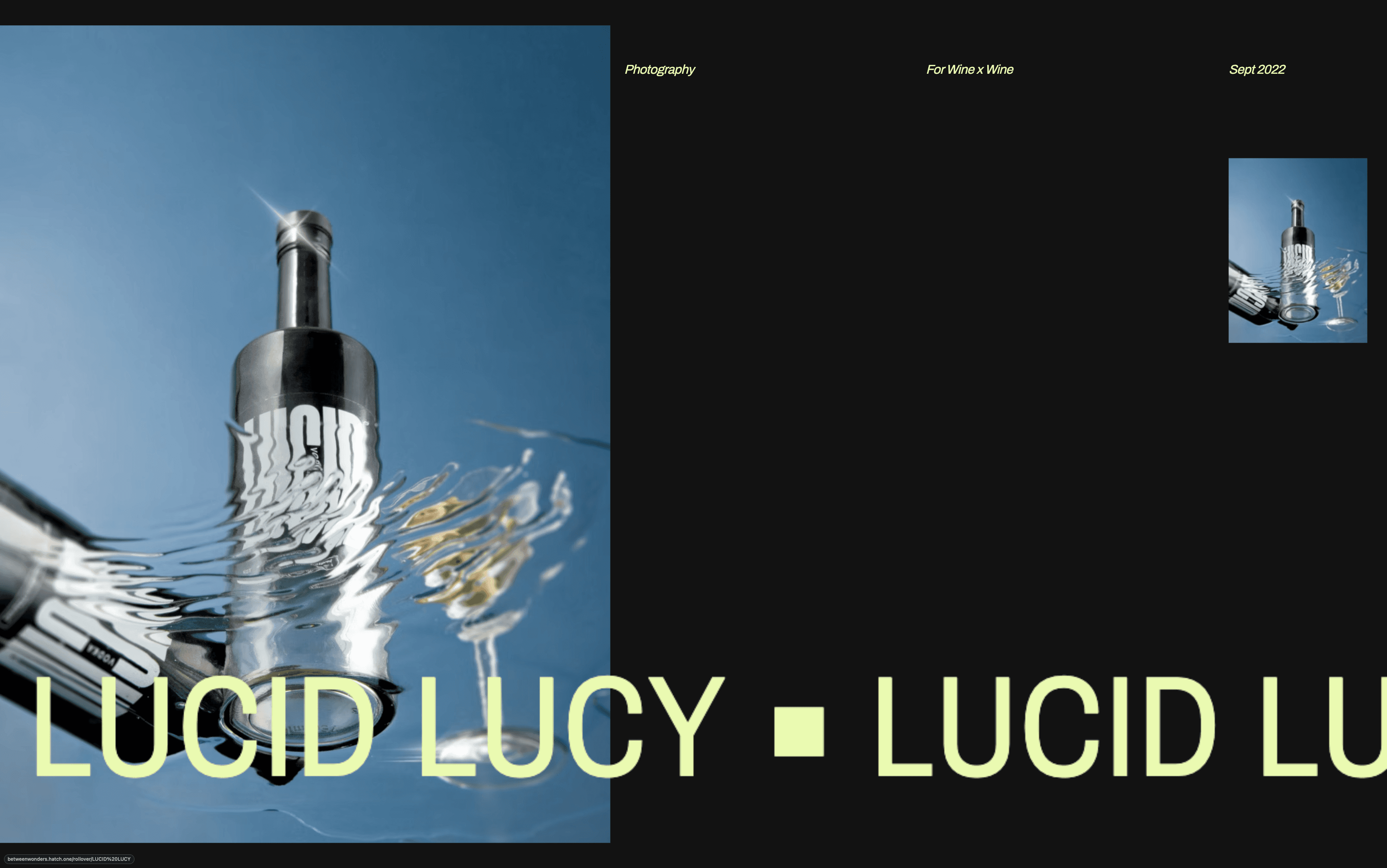
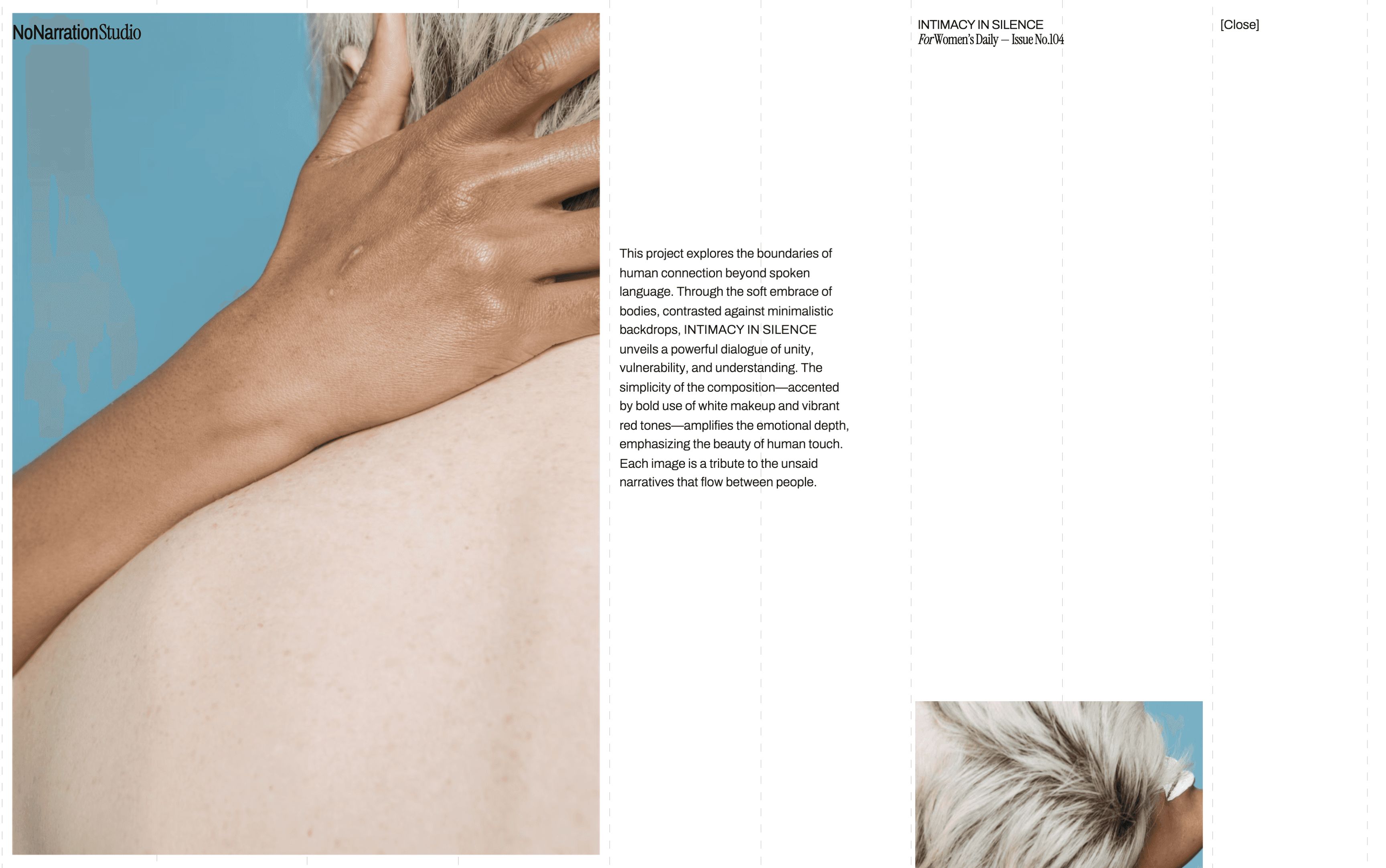
The brief was specific — we needed to demonstrate rollover effects. A feature that modern, avant-garde studios expect, where the mouse enters and something reveals itself. Simple in concept, but the execution had to feel considered, not gimmicky.
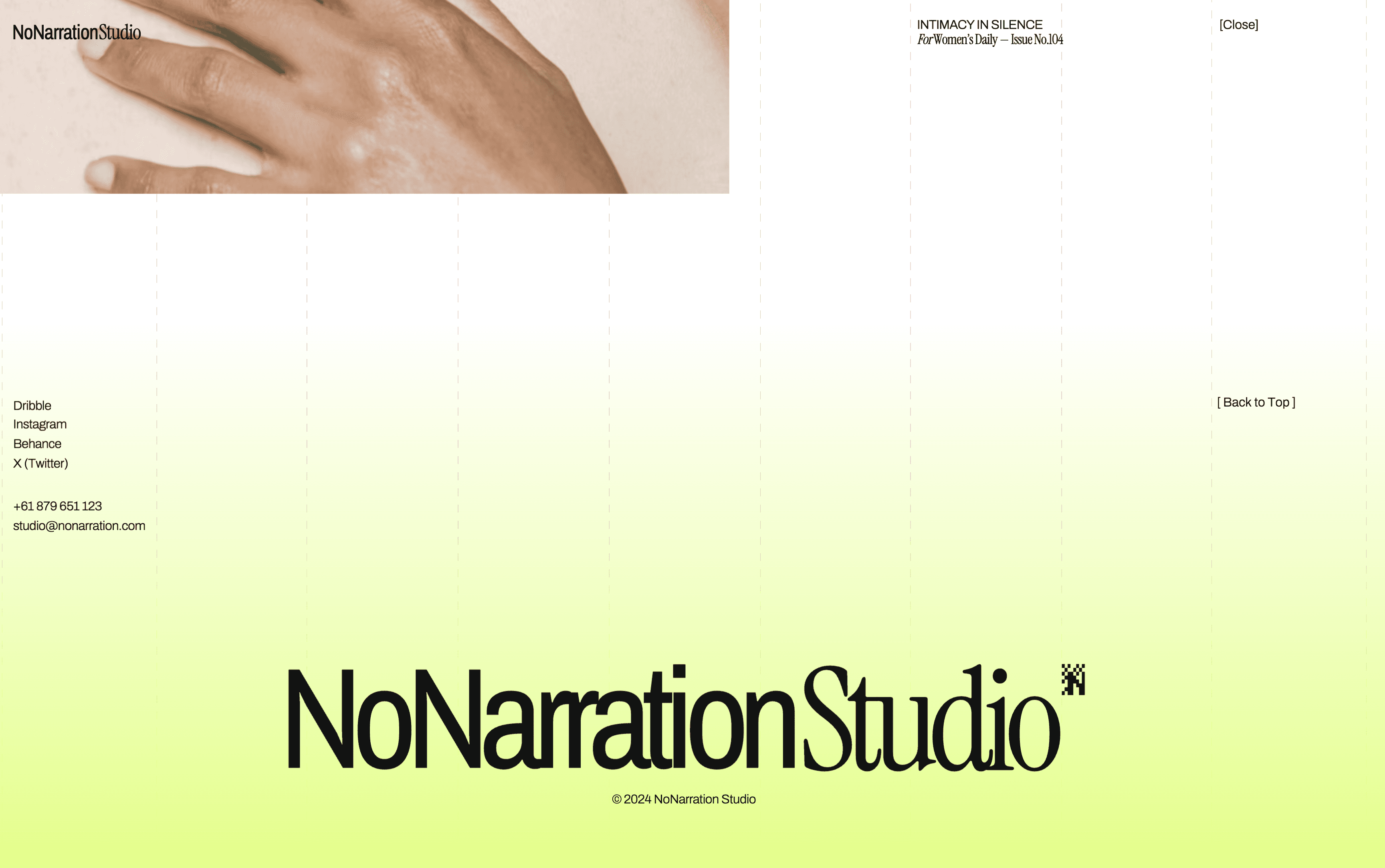
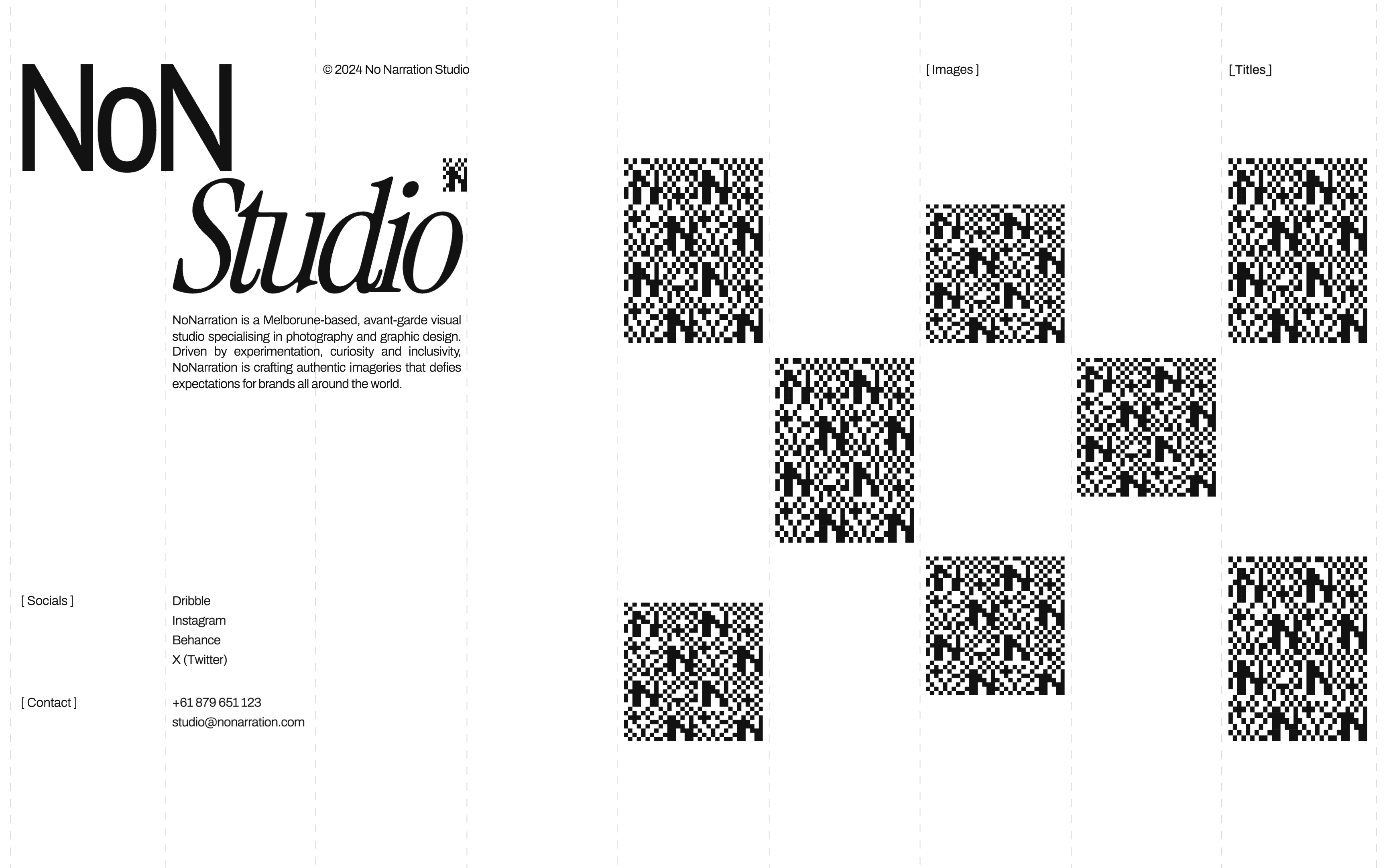
The first question I asked was: who is already building sites like this, and what are they looking at? The answer pointed clearly toward editorial design — structured grids, restrained typography, lots of images given room to breathe. For a studio like NoNarration, where the photography is the product, that structure isn't decoration. It's necessary. A visible grid eccentuates the editorial quality and gives the eye somewhere to land when there's a lot of imagery competing for attention.
The splash screen was where I had the most fun. I wanted something cinematic — a slow image scrub paired with sound, the kind of opening sequence that makes you feel like you've entered somewhere intentional. It was partly aesthetic, but also practical: with a portfolio-heavy site, large images need time to load. The scrub gives the audience something to experience while that's happening, a preview of the photography work before they've even scrolled.
A big part of template design that people don't see is the remixing experience — how easily a user can take the template and make it their own. This one had a limitation. Due to constraints in Hatch's system at the time, users couldn't replace the photo library with their own collection the way we wanted. I worked closely with the engineering team to navigate that, and a lot of my time went into bug fixing and accessibility — the unglamorous but essential work of making sure the template actually held together under real conditions.
The result is a site that feels like it belongs on Awwwards. Which was exactly the point.